本案整裝、改建自60年的台南赤崁街區的一棟二層樓街屋為現代咖啡館,這是2014年WCRC1st.p世界烘豆冠軍知名咖啡館——握咖啡的第六間店,我們以“回到過去的美好”為發想,運用日本昭和時代最經典的元素,全新打造一個符合其品牌形象的旗艦店,讓咖啡香與美好年代的印記,一起凝鍊出有溫度的空間。
This renovation of a sixty-year-old two-story shophouse into a modern coffee shop in the Chihkan District of Tainan is the sixth franchise store of OH! Café, whose owner once won World Coffee Roasting Champion (WCRC) in 2014. We began with the imagery of the "good old days" and took cues from the Showa era to build a flagship store that is worthy of its brand. The result distills the traces of bygone days and coffee smell into a warm place.
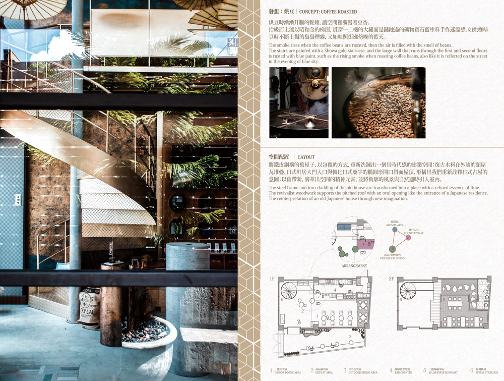
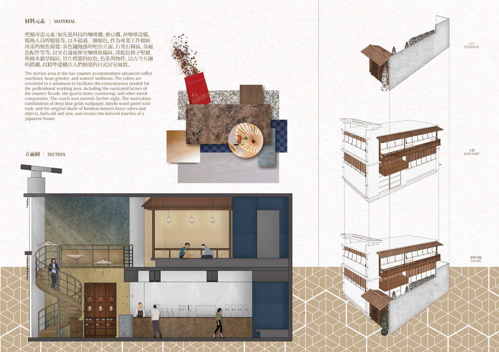
將鐵皮鋼構的舊屋子,以包覆的方式,重新洗鍊出一個具時代感的建築空間:復古木料在外牆的類屋瓦堆疊、日式町居大門入口與轉化日式廟宇的橢圓形開口斜面屋頂,形構出我們重新詮釋日式古屋的意圖:以舊帶新,滴萃出空間的精神元素,並將街廓的風景與自然適時引入室內。
The steel frame and iron cladding of the old house are transformed into a place with a refined essence of time. The revivalist woodwork supports the pitched roof with an oval opening like the entrance of a Japanese residence. The reinterpretation of an old Japanese house through new imagination.
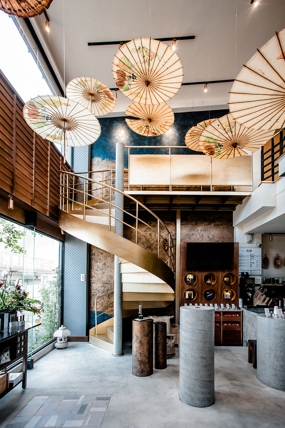
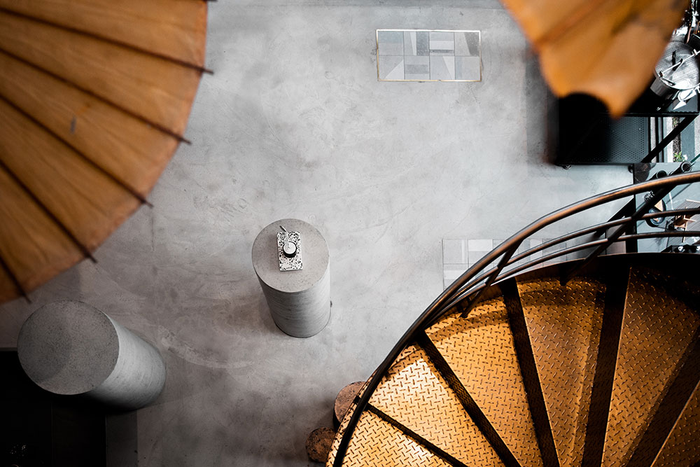
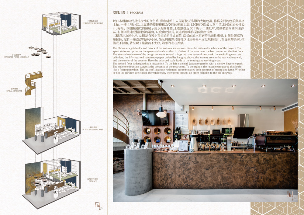
以日本昭和時代具代表性的金色系,與咖啡館主人偏好秋天季節的大地色調,作爲空間的色系與風格主軸。一樓主吧台區,以靠牆的旋轉樓梯為空間的動線定調,以引動空間最大利用值;圓弧的流暢性設計,好接引前側接連以四個展示用水泥圓柱體、上端懸掛近50年的手工油紙傘、後側櫃牆的圓洞聞香區,右側則接連吧檯圓弧的端角,尺度由此拉長,以進到咖啡作業區與座位區。
The Showa era gold color and colors of the autumn season constitute the main color scheme of the project. The spiral staircase optimizes the space and anchors the circulation of the area near the bar counter on the first floor. The streamlined curve of the design connects several things into one gesamtkunstwerk: the encircling concrete cylinders, the fifty-year-old handmade paper umbrellas hanging above, the aromas area in the rear cabinet wall, and the corner of the counter. Here the enlarged scale leads to the seating and working areas.
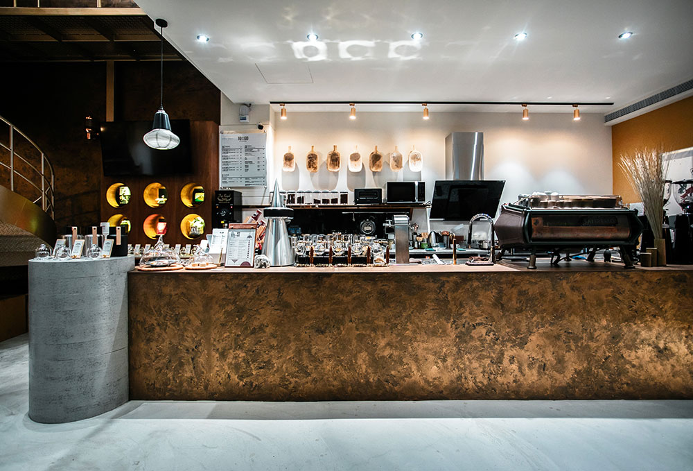
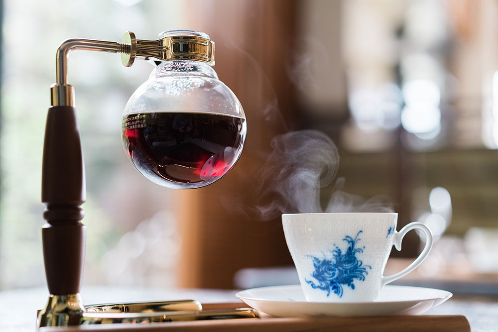
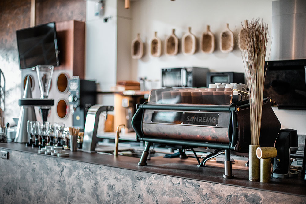
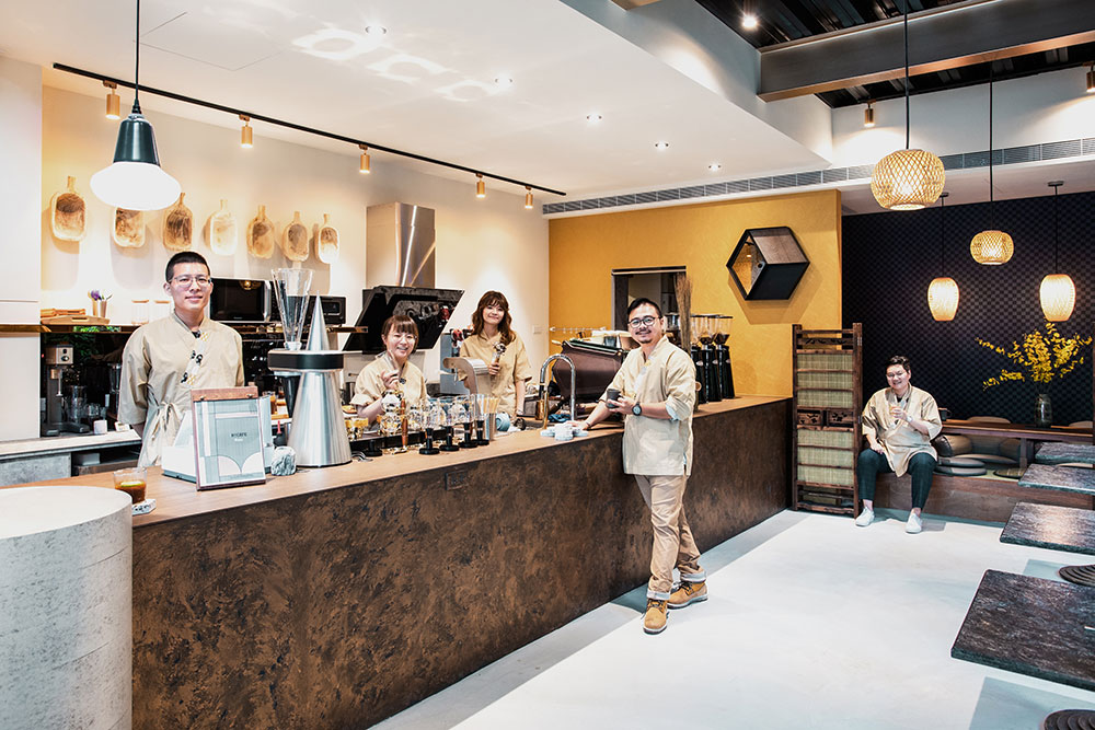
將吧檯所需元素:如先進科技的咖啡機、磨豆機、沖咖啡設備、服務人員的服裝等,以不超過三個顏色,作為專業工作檯區所需的聚焦視覺:金色鏽蝕感的吧台立面、石英石檯面、金屬色配件等等,以至右邊延伸至咖啡臥榻區,深藍色格子壁紙與檜木藺草隔屏,竹片燈籠的原色,色系與物件,以古今互融的搭襯,以精準建構出人們傾愛的日式居室風情。
The service area at the bar counter accommodates advanced coffee machines, bean grinder, and waiters' uniforms. The colors are restricted to a minimum to facilitate the concentration needed for the professional working area, including the rusticated brown of the counter facade, the quartz stone countertop, and other metal components. The couch area extends further right. The meticulous combination of deep blue grids wallpaper, hinoki wood panel with rush, and the original shade of bamboo lantern fuses colors and objects, both old and new, and creates the beloved touches of a Japanese house.
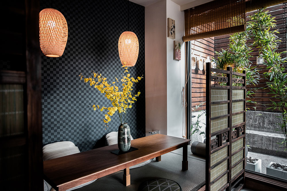
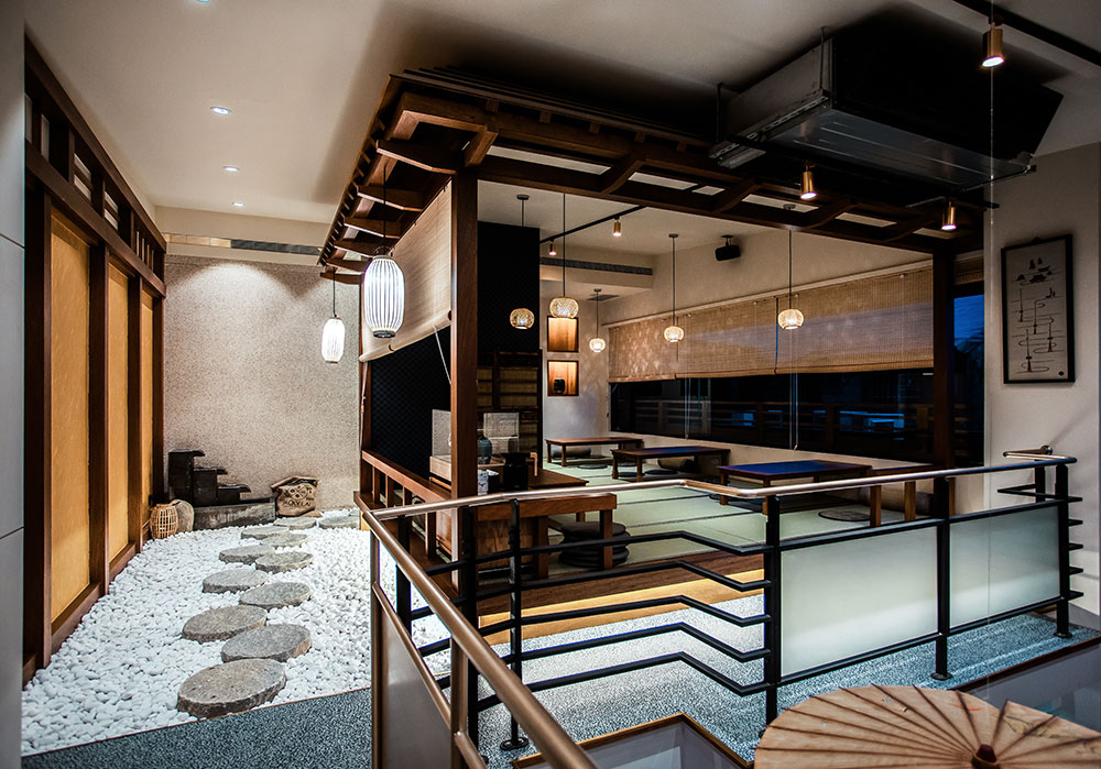
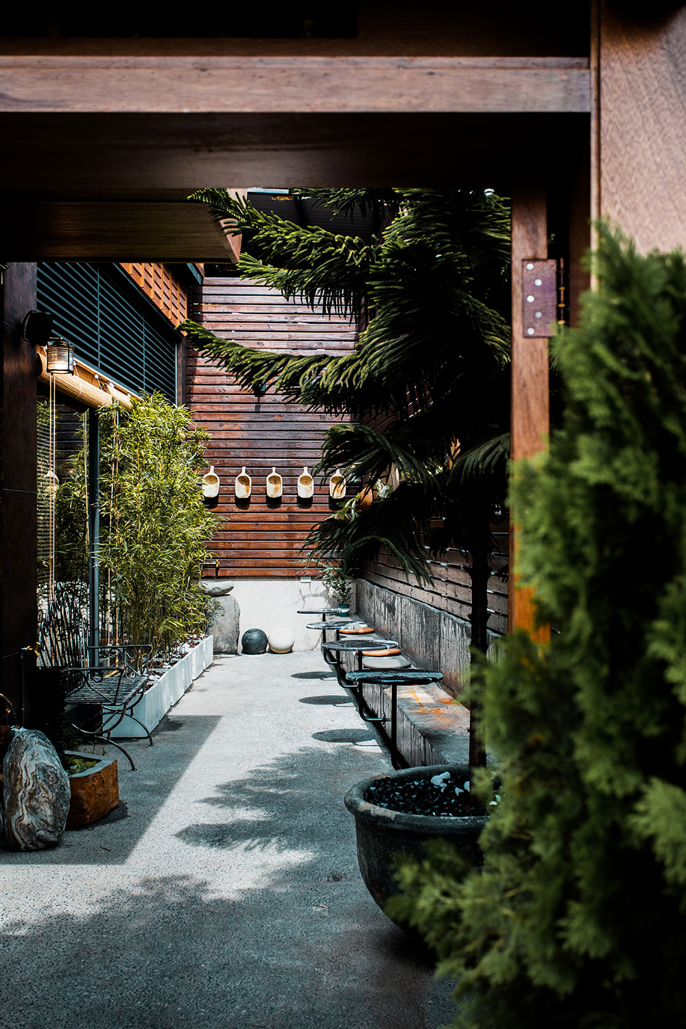
二樓設計為屋中屋,左側是有著小石步道的日式庭院,端景的流水石磨暗示通往廁所,右側是架高的座位區,宛若一座漂浮的涼亭小屋,坐臥與視野尺度皆以日式榻榻米文化規格設計,窗邊緊鄰街廓,拉簾或不拉簾,皆呈現了繁複而不失序,熟悉的老巷弄感。
The second floor is designed as a mezzanine. To the left is a small Japanese garden with a narrow flagstone path. The millstone fountain suggests the presence of the restrooms. To the right is the raised seating area that looks like a floating pavilion. The scale of Japanese rush mats accommodates both gestures of sitting and lying. Whether or not the curtains are closed, the windows by the streets present an order complex to the old alleyway.
