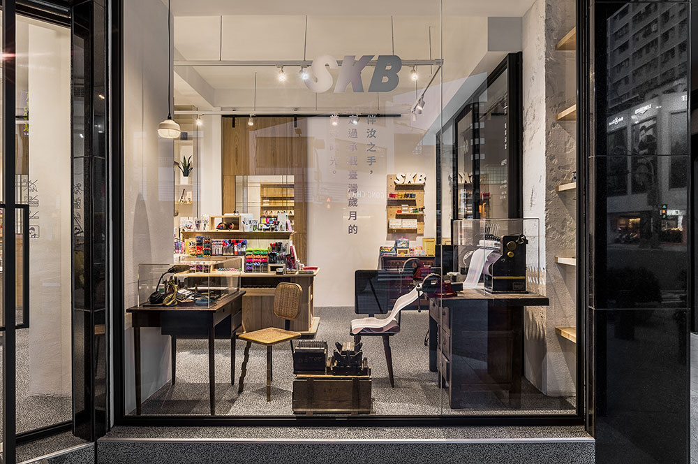
本案為改建1951年代至今的台灣老字號文具店,業主期望除了販賣自製原子筆、鋼筆等商品外,新旗艦店亦能承載傳統文化的教育功能。我們將S.K.B六十年品牌所欲傳達的流暢、知性、美感(S=smooth、K=knowing、B=Beauty)轉化為空間語彙,沿用台灣在地元素,如:老式窗花、玻璃磚、抿石子等等,重新組構、運用在櫃體、櫥窗、地面、角落,成為新舊空間交融裡的記憶符號。
The owner of an old supply shop opened since 1951, expects the renovation of the flagship store to carry the educational purpose of the cultural heritage in addition to selling their ballpoint and fountain pens. We transfigure the brand name S.K.B.—smooth, knowing, and beauty— into spatial vocabulary. Using local elements in Taiwan, such as decorative window mullion, glass block, exposed aggregate finish, to recompose and apply them as signs of memory at the intersection of new and old spaces.
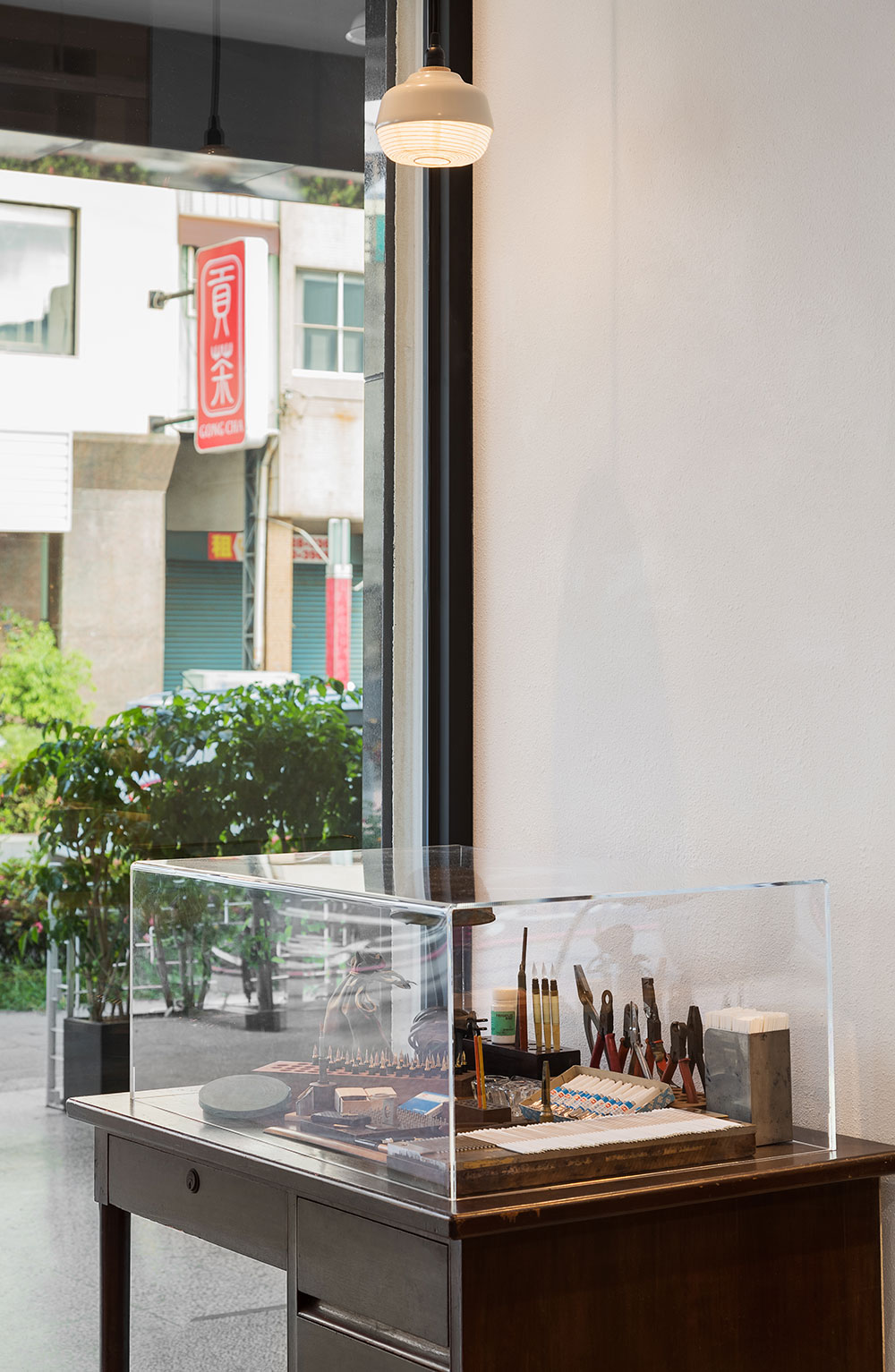
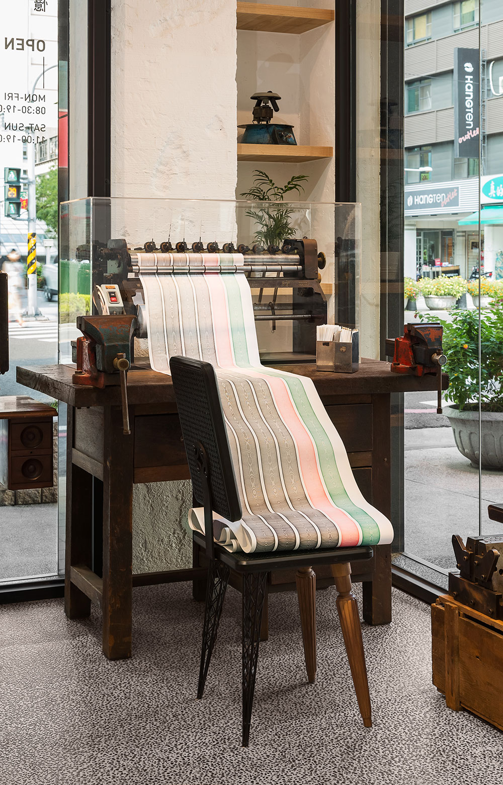
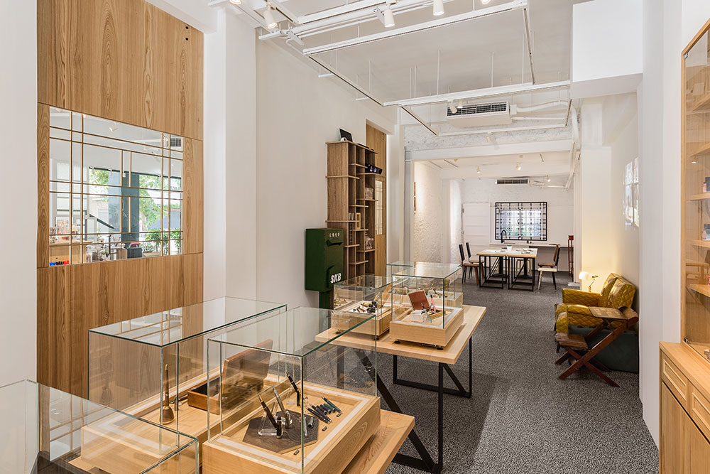
以極簡台式設計風格定調,並以“書寫文化”為精神,統合大小展區,大量的白色、灰色與淺木色等樸素的材料質感砌築天地壁,讓場域主體能被清楚呈現:古董製筆機器、工具、有歷史的鋼筆、原字筆的流年歲月,分置在臨窗處、中央展區與歷史展示專區,讓商品在具文化脈絡的空間氛圍裡,易於被大眾接觸與擁有。
Coupled with the value of writing culture, the minimalist Taiwanese manner integrates the display areas with austere materials of white, grey and light brown colors stretching all the way to ceilings and floors. The central area is thus articulated: the antique pen making machine, historic fountain pens, years of ballpoint pens are displayed in the shopwindow, central display area, and historical display area. The products become accessible to the visitors and easy to acquire in an aura of cultural context.
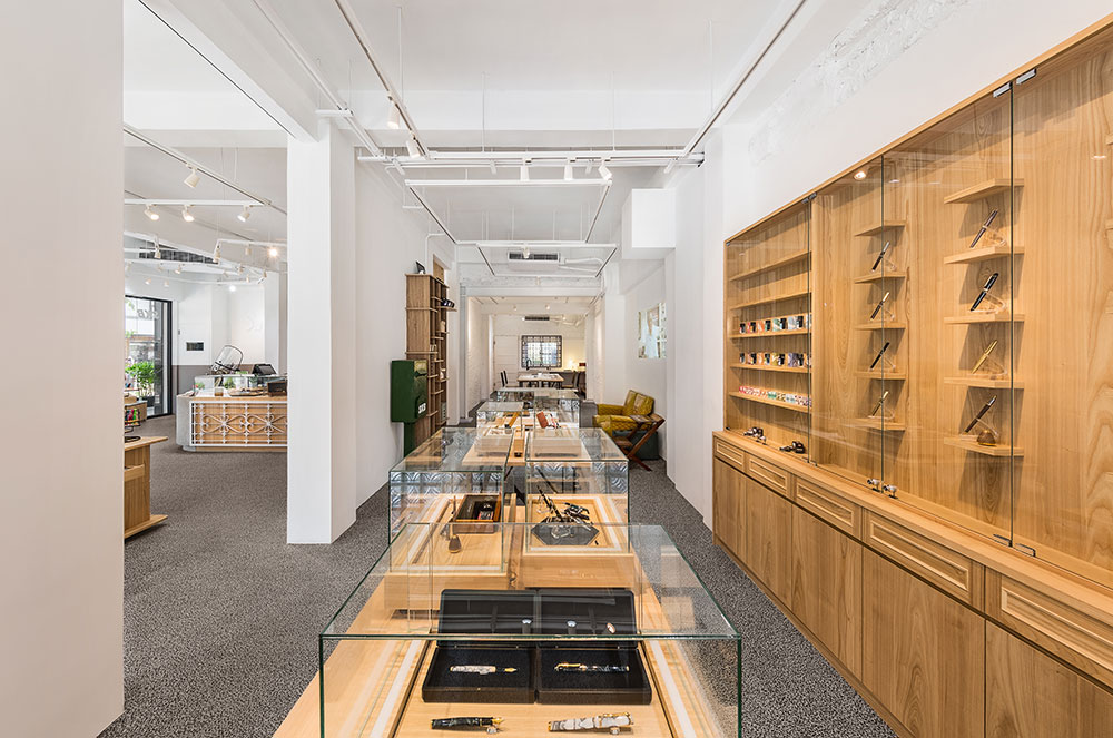
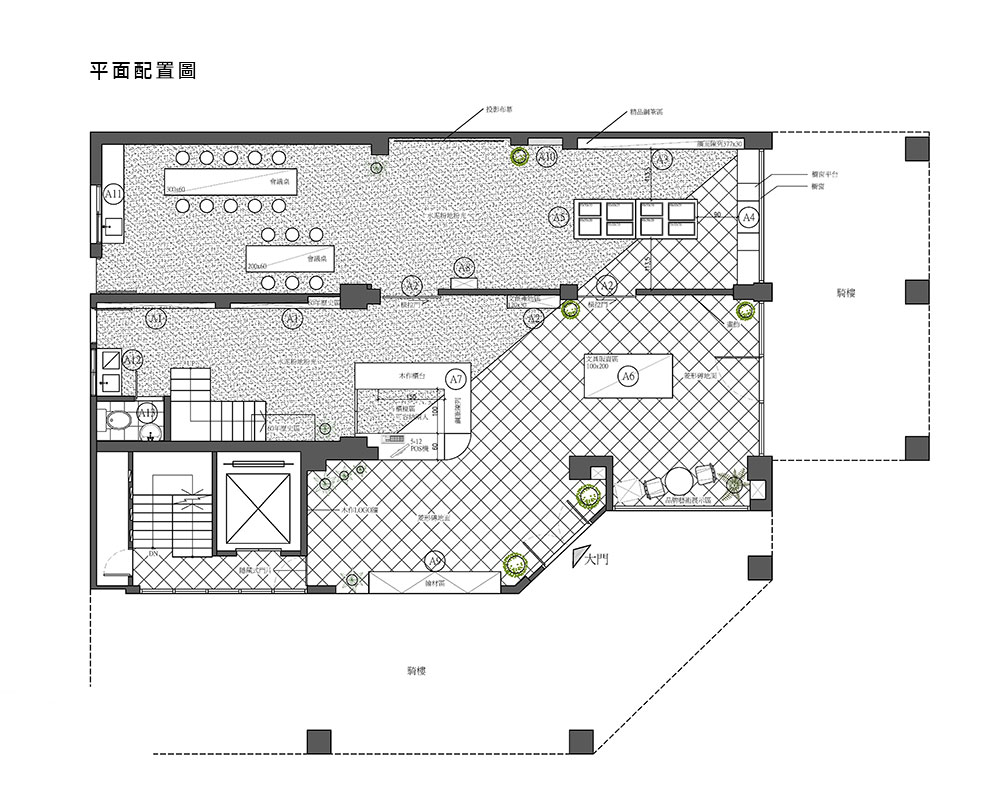
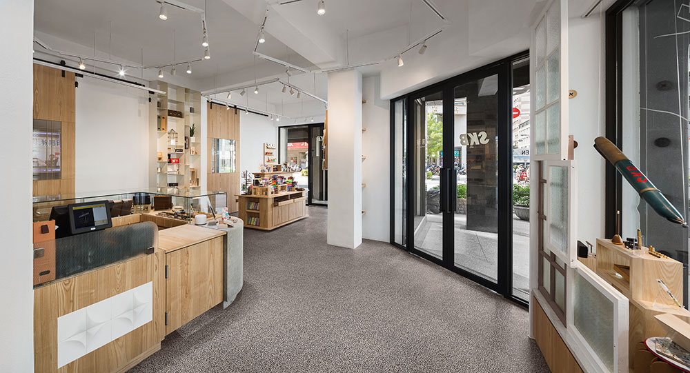
以異材質拼貼的櫃檯為中心,天花板上的六角型長型軌道燈微微暗示格局分佈,陳列架沿著軸線展開,平台式、壁掛式陳列框架以其適切比例切劃以符合產品尺度,線條縱橫拉出時代美感,木、鐵、玻璃,輕盈化櫃體,既復古又具現代洗鍊感。
Using the counter of diverse material collage as the center, the hexagonal rail lighting on the ceiling suggests the divisions of the exhibition shelves along the axis. The platform type and wall-mounted shelves area allocated according to their appropriate proportions and scales. The linearity extends into the zeitgeist of wood, iron, and glass. The lightness of the shelves expresses both antiquarian and modernist austerity.
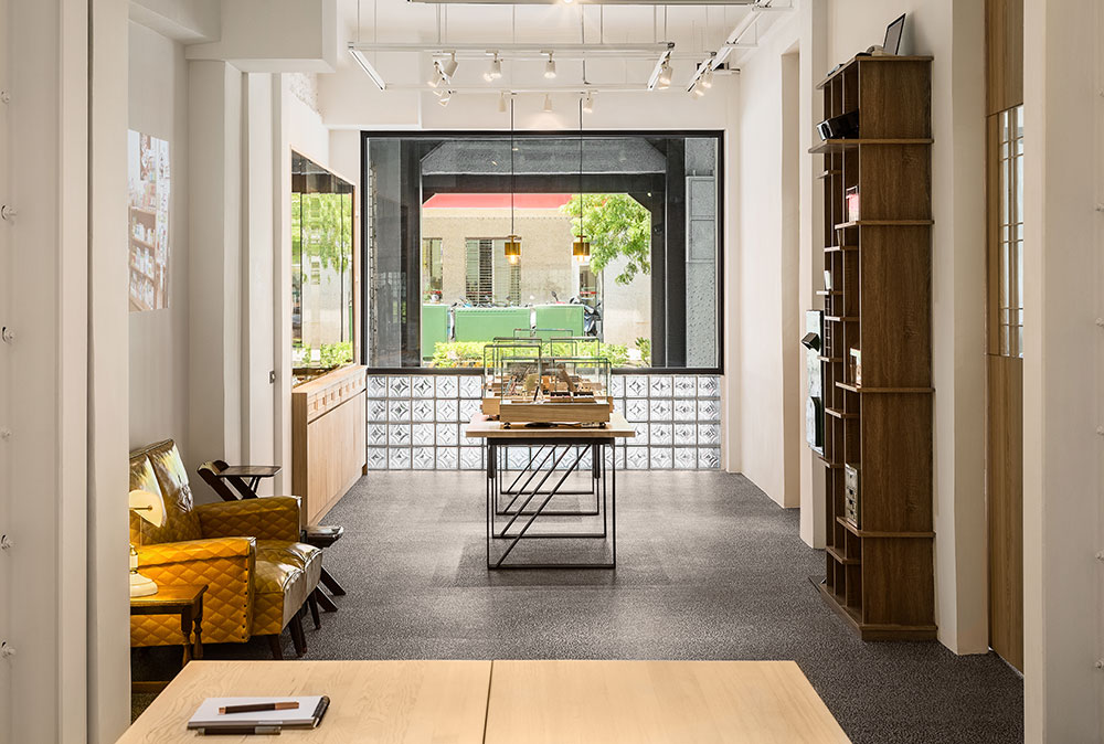
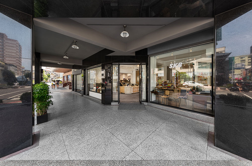
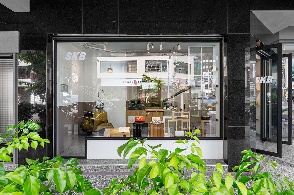
更新裝修店面為一個跨時代意義的空間,大部份維持建築原尺度,僅部分更動室內牆桓,讓開闊與隱蔽性更為分明,並修復舊大樓的外觀與騎樓、改善入門動線與門框形制,大面的落地窗,窗櫺几淨,將室外的在地街景融入室內而無界線感,仿若時代總是以無痕的方式滾動生活與文明,而復古情懷總是不落伍地成為超越時空的珍貴介質。
The renovation of the storefront is a space straddling on the passage of time. Most of the areas in the building retain their original scale. The slight alteration to interior walls articulates the division between openness and privacy. The exterior and the arcade have been restored and the circulation and doorframe typology improved. Large glass panel and clean desktops bring in the view of the local street into the inside with no sense of boundary, as if time always propels life and civilization without its trace. Revivalism, in this light, is not old fashion but a precious medium that transcends space and time.
